Custom homepage design
A homepage built around your dining room, not a swapped-logo template, with the reservation path visible from the first screen.
Good restaurant website design answers two questions before a visitor scrolls: is this place open right now, and where do I sit. Everything else on the page, the photography, the story, the seasonal specials, exists to support that decision. We build sites for social dining spots that settle both questions on the first screen, on a phone, in a few seconds.
What it costs
Owners of independent restaurants, bars and cafes whose current site looks nothing like the room: a dated template, stock photos, or a design that falls apart on a phone.
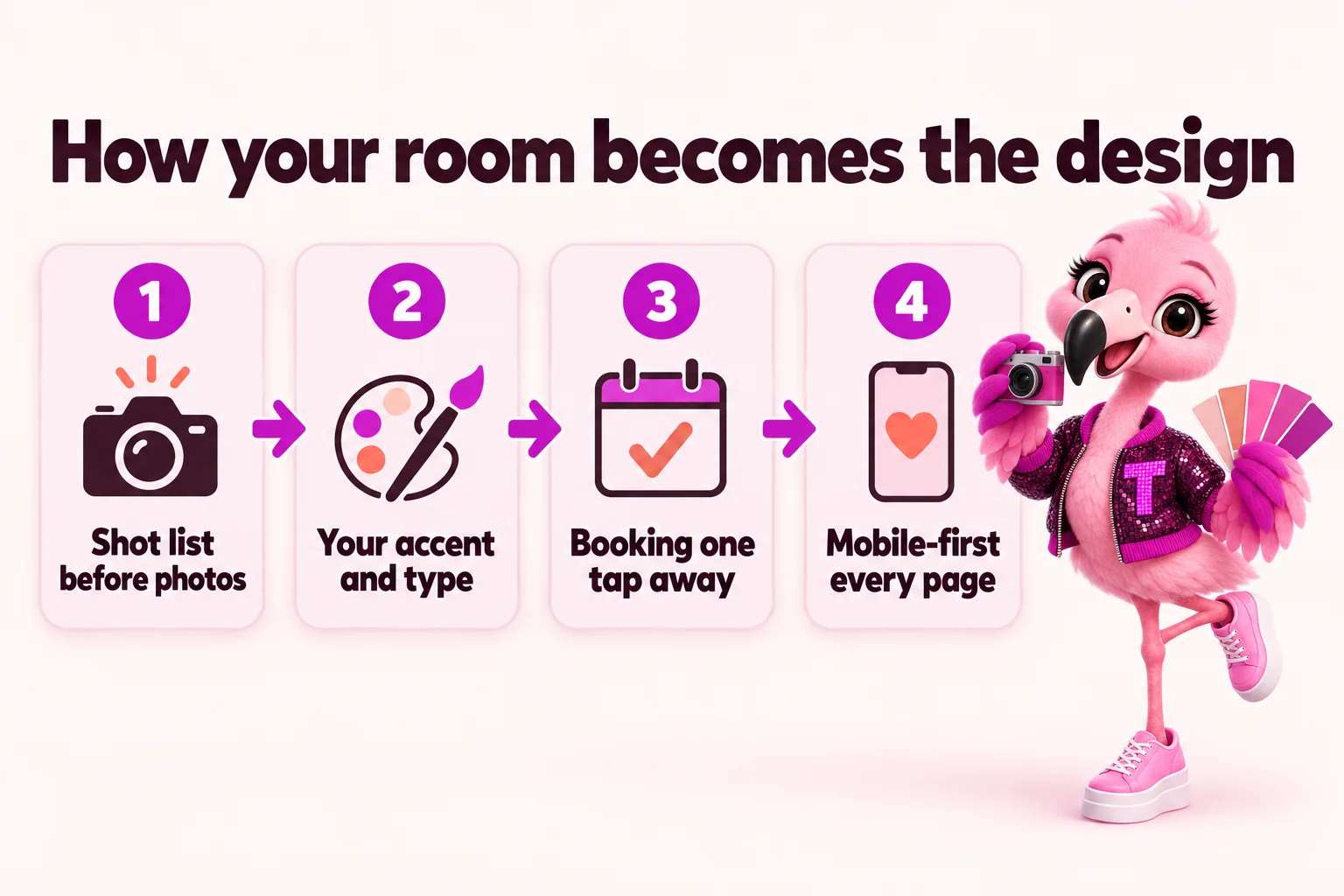
A neighborhood restaurant sells a feeling before it sells a menu, and photos are the fastest way to transmit that feeling. We design the homepage around a rotating set of real images from the actual dining room, bar and plates, never stock photography of a restaurant that isn't yours. The gallery structure matters as much as the images themselves: a strip that shows the room at night, a close crop on a signature dish, a wide shot of a packed bar on a Friday. We give you shot guidance ahead of any photo session so the images we get back actually fit the layout, instead of cropping awkwardly into a hero that was designed for something else.
Every screen of the site keeps a path to booking within reach, because a visitor who has to hunt for the reservation button usually just calls the next place instead. We place a persistent "Book a table" action in the header and repeat it after the photos, the menu teaser and the location block, so scrolling never buries it. On mobile, that button is sized and positioned for a thumb, not a mouse. If you run a waitlist app or a reservation platform, we wire the button straight into it; if you don't yet, we build a clean request form that lands in your inbox until you do.
Most people decide where to eat while standing on a sidewalk or scrolling on a couch, so we design for a phone screen first and expand up to desktop, not the other way around. Text sizes, tap targets and image crops are chosen for a five-inch screen before we ever check how they look wide. We also build for speed: pages ship at 90+ PageSpeed, so a photo-heavy homepage still loads before someone gives up and taps back to a map listing. A beautiful site that takes eight seconds to load loses the exact visitor it was built to win.
A wine bar, a rooftop patio and a brunch cafe should not share the same layout just because they're all restaurants. We pick one accent color and one type pairing that match the room's actual personality, whether that's warm and low-lit or bright and citrusy, and we carry that through every page instead of letting the design shift halfway down the site. Corner radius, spacing and button style stay consistent site-wide too, because small inconsistencies are what make a site feel assembled from parts rather than designed as one place.
The homepage is not the place for a mission statement, a slider of eight rotating banners or five competing calls to action. We keep one primary action, one secondary path (usually the menu or the ordering page if you take pickup orders), and let the photography and the room's atmosphere do the rest of the persuading. Restraint is a design decision too, and it's usually the one that separates a site that converts from a site that just looks busy.
A 30-minute walk-through of a site for your kind of room. Plans from $117 a month, live in 7 days, the $647 build fee invoiced only after you approve the launch.
A homepage built around your dining room, not a swapped-logo template, with the reservation path visible from the first screen.
A shot list matched to the layout so the images you provide (or have taken) actually fit where they need to go.
Menu, about, location and contact pages all designed for a phone screen first, then scaled up to desktop.
A persistent booking path repeated through the page so a ready guest never has to scroll back up to act.
One accent color, one type pairing and one radius system, carried through every page consistently.
Photo-heavy pages that still load fast, because a slow site loses the exact visitor it was designed to win.
5 revisions a month are included after launch, then $20 each, so the design keeps pace with your menu and your room.
The parts of each plan that do the work on this page, what they solve, what you do, and which plan carries them.
A photo-forward layout that makes the space and the plates the main event.
Update prices, specials and dishes yourself, or hand it to us, without touching code.
Custom-coded pages served from the edge, 90+ PageSpeed guaranteed.
Your booking and waitlist tools live on the page, not buried behind a link.
Saying what we do not do makes the rest easier to trust.
No mystery between paying and opening the doors. Here is every step, who does it, and how long it takes.
The monthly fee starts the plan. The $647 build fee is not charged now.
Your part: Choose a plan.
Menu, hours, locations, photos, brand and where inquiries should land. About 15 minutes; send what you have and the rest later.
Your part: About 15 minutes.
We fill any gaps, agree the pages and lock the launch date. The build clock starts here.
Your part: One call.
Live in 7 days on The Table, 10 on The Full House while the AI Engine learns your details, 15 on Standing Room Only. Real menu, real photos, reservations wired in.
Your part: Nothing, unless we ask.
You see the finished site first. The $647 build fee is invoiced only after it is live and you are happy with it.
Your part: Approve.
5 revisions a month, each within 2 to 5 working days, weekly articles, your map listing kept in step, speed checked after every change.
Your part: Send changes from your client portal.
Short answer: a fast, relevant page helps you keep the visitors you already pay for and can lower what each ad click costs. We build every site to load fast from day one and keep it that way after every change.
Every page is custom coded, ships very little JavaScript and is served from a global edge network, with 90+ Google PageSpeed guaranteed on mobile and desktop. Menus, hours and the booking button load before a guest standing on the sidewalk gives up.
Google Ads rates every keyword with a Quality Score, and landing page experience is one of its three parts. A page that loads fast and matches what the ad promised helps that score, and a stronger Quality Score can lower what you pay for each click and improve where the ad shows.
Every guest who taps an ad and leaves before the page appears is money spent on nobody. A page that opens quickly helps reduce those lost visits, so more of the paid clicks you already buy reach the menu or the booking step.
We do not promise a specific cost per click, percentage or ranking; ad prices depend on your bids, competitors and keywords. Source: Google Ads Help, "About Quality Score for Search campaigns", accessed September 18, 2026.
Guarantees with the conditions visible. Neither guarantee is a refund: the remedy is the corrective work, and neither covers changes made by you or third parties, content published against our advice, or ranking outside your area and services.
On mobile and desktop for every page we build and host. If a page drops below it because of our work, fixing it is on us, not a paid revision.
We guarantee your site starts ranking for local searches in your area within 3 to 5 months of launch. If it has not, we keep doing the search work at no extra charge until it does.
The $647 build fee is invoiced after the site is live and you are happy with it. You never pay for a build you have not seen.
Your domain is registered in your name. If you leave, we transfer it free and send an export of your content and articles within 14 days.
Email us at least 2 business days before your next invoice, during business hours (9 a.m. to 5 p.m. Central Time, Monday to Friday). You can cancel at any time.
All sales are final, except a duplicate or incorrect charge from our billing, which we correct if you tell us within 30 days. Full wording: terms and refund policy.
I tested the bistro private dining page on my own phone before we approved anything. The important details sit near the top and the inquiry button is impossible to miss. Sending the link by text during a call finally works the way it should.
I was sceptical that a guide would change much for bistro private dining. I was wrong. People come to the first call prepared, and nobody has been asked to upload anything premature. First conversations are shorter and better because of it.
The idea that visitors could sort themselves before writing seemed obvious only in hindsight. Visitors choose what they are doing first, and each choice leads to a fit-for-purpose form. The morning triage is minutes rather than an hour.
Real projects, told from the starting point to what changed, in the words of the people who run the floor.
Restaurant website design with us starts at $117 a month on The Table plan, which covers the fully managed site itself, plus a $647 one-time build fee invoiced only after your site is live and you're happy with it. Higher tiers add an AI engine or a content engine on top of the same design foundation.
Most restaurant sites launch in 7 days on The Table, or 10 to 15 days on plans that include more content, since we design, build and load real photography and menu content before launch rather than shipping a placeholder shell.
Yes. 5 revisions a month are included, and additional requests are $20 each, so seasonal menu swings, a new hero photo or a repositioned reservation button are normal maintenance, not a re-negotiation.
We start from a designed template built for social dining rooms so you're not paying for a blank page, then customize the color, type, photography and layout so the finished site reads as your restaurant, not a theme.
Yes, every page is designed mobile-first and then scaled up, because most guests are deciding where to eat from a phone, and the layout, text size and tap targets are chosen for that screen before desktop is even considered.
Yes. We build the layout around the strongest photos you have and tell you which extra shots would help most, such as the room at night, a signature dish close up, or a busy bar. We do not take photos ourselves.
No. Each site gets its own accent color, type pairing and layout choices based on your room. Starting structures are shared; the finished design is yours.
Yes. You review the finished site before it goes live, and the $647 build fee is invoiced only after it is live and you are happy with it.
Fair comparisons written for restaurants, including when the other option is the better fit.
A live walk-through of the site you would get, in about 30 minutes. Plans from $117 a month, the $647 build fee invoiced only after launch, domain and hosting included.
Book a demoOr email and a person replies within one working day.
EateryWebStudio uses the cookies below. Necessary cookies keep the site working and cannot be turned off.
Saved on this device only. Press Esc to close.